In a previous post, Research and Analytics Dashboards: From idea to design, we talked about the key components for planning a research data dashboard including knowing your audience, focusing on key metrics, and organizing the components into meaningful stories.
In this post, we’ll share specific tips for designing the dashboard itself, the design tips that make users go WOW and have a great experience using the data.
Choosing Charts
As pretty as they may be, charts should never be designed nor selected for their good looks. Square charts should not be selected to fill square spaces on a dashboard nor rectangle charts to fill rectangle spaces. Charts must be selected to meet a specific purpose and convey specific information. Once you know the type of information that needs to be shared and the story the chart needs to tell, one or two specific charts will become obviously appropriate.
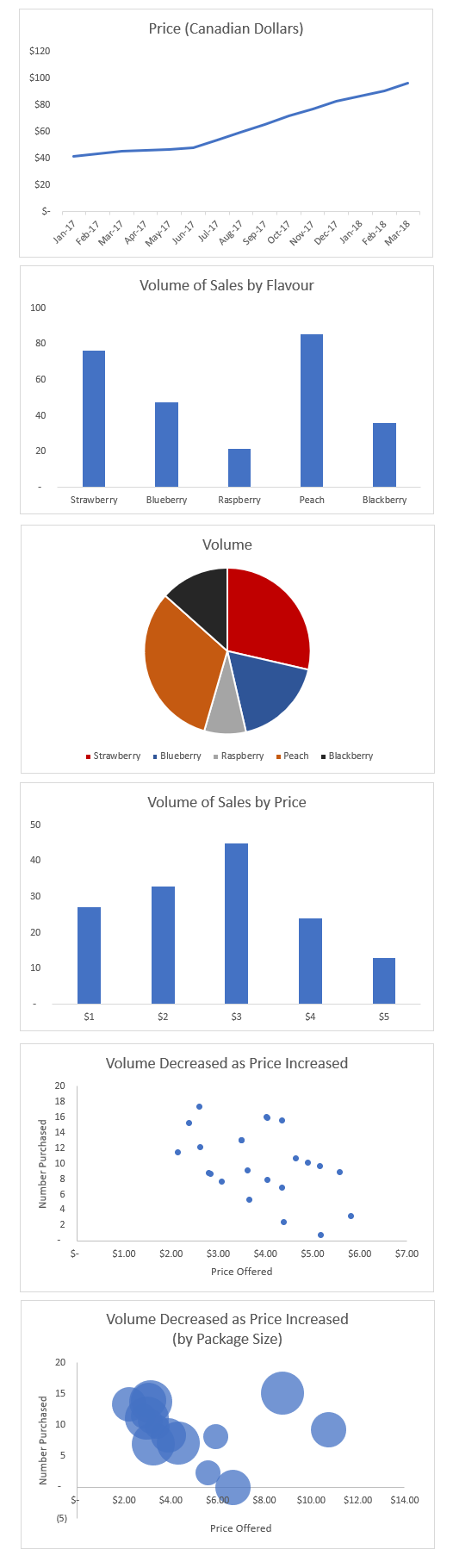
Line charts tell stories about time. They show how metrics increase or decrease from minute to minute, month to month, quarter to quarter, or year to year. By including several lines in a chart, you can tell stories over time about several different things.
Bar charts tell stories about categories of things. They allow you to show how demographic groups, product features, or other categorical features are the same or different from each other at one point in time.
Histograms tell stories about the range of opinions (or metrics) people can have about one thing. For instance, people’s opinions about purchase intent can range from extremely low to extremely high. Other metrics like height, weight, price, and temperature can also range from low to high.
Pie charts tell stories about share, or parts of a whole. They are best for showing percentages that add up to 100% and, in particular, when there are just a few slices in the pie. You could show the percentage of total sales that come from each of four product lines, or the percentage of sales from each month of the year.
Scatterplots tell stories about the relationship between two quantitative variables. The relationship between height and weight is perfect to show in a scatterplot. You could also choose to show a relationship between price and purchase rates, or price and sales volume.
Bubble charts tell stories about the relationship between two quantitative variables, and one more variable. For instance, height and weight could be the X and Y axes, and the size of the bubble could reflect age or gender. Similarly, price and purchase rates could b e the X and Y axes, and the size of the bubble could be package size or a product feature.
As with all things, complexity is not a requirement. In fact, complexity should be avoided at all costs. Simple charts are often the best way to communicate a complicated issue.
Choosing Colours
Hues: Instead of relying on default chart colours, choose chart colours purposefully. Avoid bright colours in favour of muted colours. Avoid colours that are too similar to each other. And most of all, avoid colour combinations that make reading difficult, e.g., yellow on white, blue on red, orange on green.
Accessibility: 1 in 12 men and 1 in 200 women have colour vision deficiency. In other words, nearly 4.5% of people are physically incapable of seeing colours the same way most people do. If dashboards are not designed with this in mind, many people will be automatically excluded from benefiting from a dashboard. Use a website like toptal to check how your dashboard would look to someone who has colour blindness. And then fix your dashboard so everyone can take advantage of it.
Inherent meaning: Even people who’ve never driven a car know what stoplight colours mean. Green is good, red is bad, yellow is in between. The inherent meanings of green, red, and yellow can be applied to dashboards as well. Use green for trends or relationships that are positive or doing well. Use red for trends that are negative or doing poorly. If you need to identify metrics in between, choose yellow or blue colours. And of course, check that the colours are accessible.
On the other hand, since about 1940, we’ve been taught that pink means girls and blue means boys. Designers are now eschewing this unnecessary stereotype in favour of colours with no gender history. Feel free to choose any colour for male and female as long as those colours are consistent throughout every chart.
Less is more: After highlighting something in green, you might feel the need to highlight the opposite component in red. Resist the urge! If attention ought to be focused on the green items, there is no need to add any other colour. The job required of the green colour has been done.
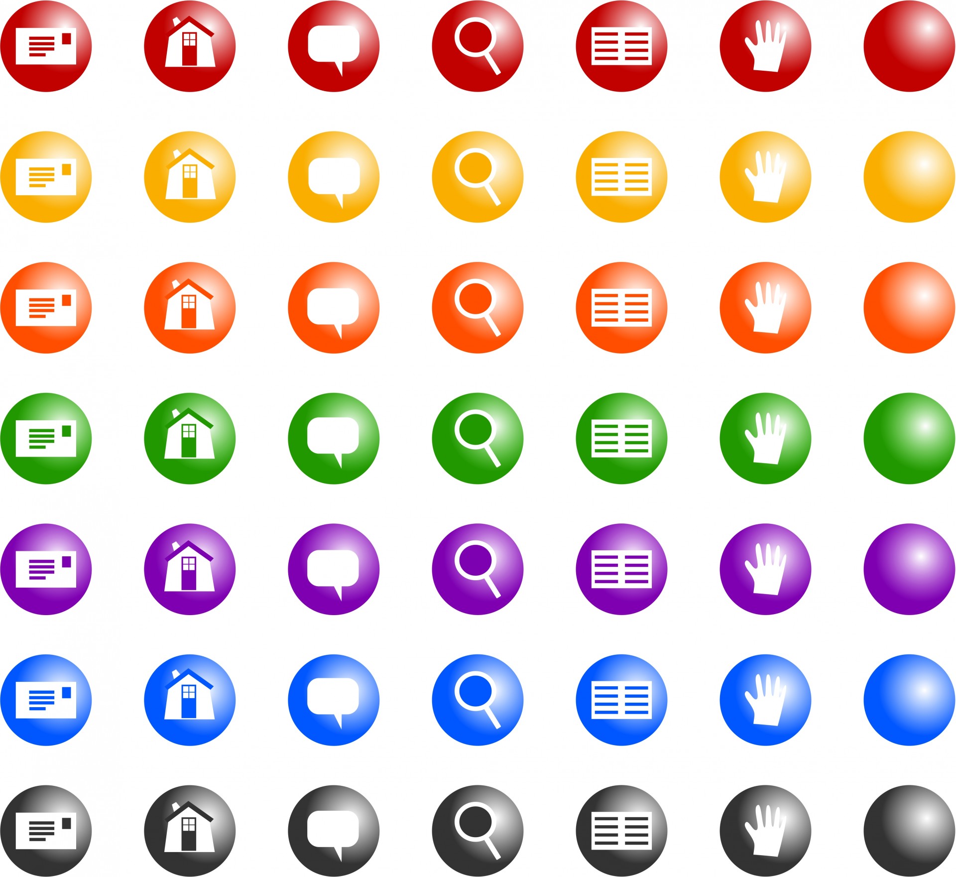
Choosing Icons
![]()
Most dashboards use a least a few icons. Not only do they add a little flavour and creativity to the dashboard, they help users find components more easily.
If your budget is tight, a quick search on Google will identify many images that are labeled for free reuse – be careful not to use images that you don’t have permission for. For instance, this free set offers icons for email, a house, a comment box, and a magnifying glass in 7 different colours.
The other option is to take advantage of custom icons. A skilled illustrator can develop icons that meet your precise needs of image, shape, size, and colour.
Most of all, no matter which option you choose, be sure to use icons that won’t be misinterpreted as bacon!
When you’re ready to build an effective dashboard to help you interpret and act on your data more quickly, please get in touch with us.


