As delightful as a 100-page report is, especially when it’s tracker results delivered 4 or more times per year, sometimes creating a custom dashboard is the only logical way to present research results. A well-designed dashboard makes it vastly easier to interpret and monitor complicated data, it increases productivity, and it makes it much easier to convert insight into action.
Here are some tips to help you get the most out of your dashboard.
Know your audience
As with many things, there is no such thing as a one size fits all dashboard. An effective dashboard meets the needs of a specific audience and displays the unique pieces of information they require.
High level executives, including the C-suite and executive leadership team, require a strategic dashboard that incorporates high-level Key Performance Indicators outlining the overall effectiveness of their business. While they are probably interested in the minutiae of their company, they really need to focus their skills and attention on top-level success rates and company-wide financial goals.
On the other hand, project managers require an analytics or operational dashboard that offers them deep dives into different aspects of specific projects. While they are probably interested in the overarching success of the business, they need to focus their skills and attention on evaluating the precise criteria of various research projects so they can build and improve the features of products and services.
Because the two audiences have different needs, their dashboards will contain completely different metrics. As convenient as it would be to create one dashboard for everyone, this will only lead to either abandonment of the dashboard, or confusion and misuse of the dashboard.
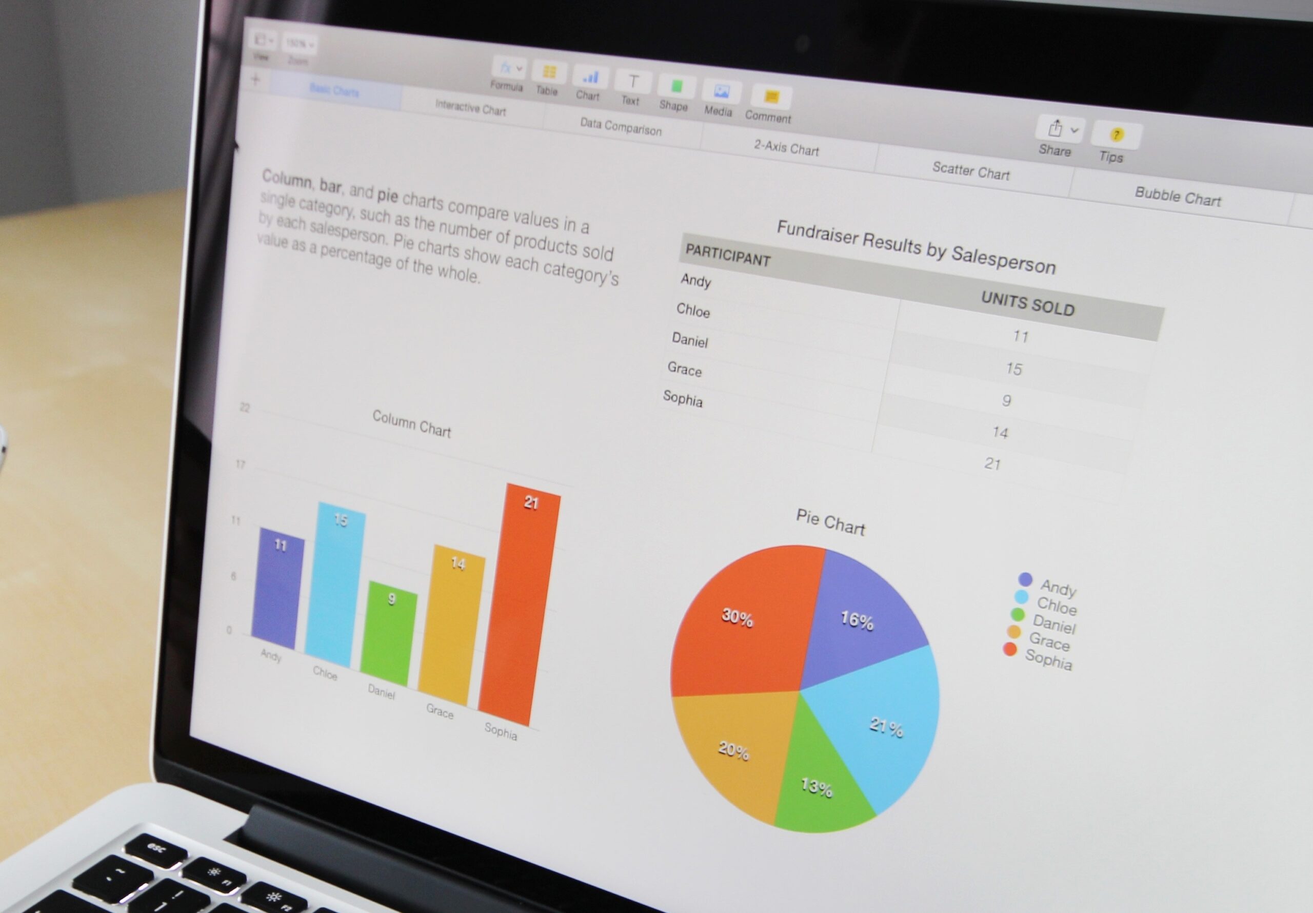
Focus on Key Metrics
Anyone who builds questionnaires, works with Google Analytics, or prepares spreadsheet results knows that summary presentations and dashboards are often cluttered with a multitude of extremely interesting datapoints that aren’t actionable. Including extraneous pieces of information in dashboards makes it difficult to identify key take-aways and act on the most important pieces of data.
With that in mind, dashboards should aim to include only the minimum number of visualizations required by the specific audience. If the CEO only needs and uses 5 metrics, then don’t add more simply because space is still available. White space is important space. Conversely, if a project manager needs and regularly uses 30 metrics or more, then take advantage of organizational techniques to include those metrics in a way that isn’t cluttered and overbearing.
Identify the Need for Speed
A dashboard is only useful if it provides the key metrics at the speed you need. Last quarter or last week metrics aren’t very useful to project managers who need to check research quotas on a daily basis. Conversely, there’s no need to jump through technical data hurdles to deliver daily metrics when the CEO only needs weekly or monthly financial metrics.
Organization is Key
Dashboards must tell a story. As every good journalist does, a story starts by immediately describing the key insights at the top at the top of the page, and ends with the delivery of precise details and deep dives at the bottom of the page. If this is done well, the key takeaways of a dashboard can be identified and understood in just seconds, and people will be more likely to integrate use of the dashboard into their daily routine. Good rules of thumb include the following:
- Group similar items together. In the research world, this could mean grouping together purchase intent scores from 20 different SKUs, or every key metric for one SKU, or widely disparate items that together create a story, e.g., all the metrics within the purchase funnel. Whichever grouping method is selected, be sure to consciously select a system. Make sure the items complement each other to tell an impactful and actionable story.
- It’s not a jigsaw puzzle. Don’t try to fill in every empty space on the page as if you were putting together a puzzle. Focus on organizing the items into coherent stories and let the white space do its job of creating visual breathing room.
- Use space wisely. If incorporating a logo is necessary, relegate it to the bottom of the page. People in the western culture have learned to read top to bottom and left to right which means our most focused attention is placed on the top left corner. As such, your key metric deserves to occupy that prime position. If you’re preparing a dashboard for people who use a different reading proces, keep that in mind.
- Use filters to save space and create simplicity. Within the research industry, common filtering variables include demographics like gender and geography, or test groups like Package A and Package B (and Package Z!). Filters allow you to find and present data for every group quickly and eliminate the need to create vastly longer or larger pages. Keep in mind that using a filter may prevent users from seeing items side by side so be prepared with solutions that can show side by side data should the need arise.
We’d love to help you design a dashboard that meets your unique needs. Please get in touch with us!

